Responsive CSS Classes & HTML Elements
Resize this page to see these live examples in action.
- Show Only on Desktop (.desktopOnly)
- Show Only on Mobile (.mobileOnly)
- Full Width on Desktop (.fwd)
- Full Width on Mobile (.fwm)
- Horizontal Link List
- Vertical Link List
Show/Hide Elements Based on Desktop/Mobile Device
There are two class that can be applied to any element to control desktop/mobile display. Even though we are using images in the example (below), these two classes can be applied to any html element.
.desktopOnly
Element will only appear on a desktop browser
Example:
You will only see the image of the desktop computer (below) on desktop browsers.
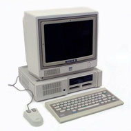
<img class="desktopOnly" src= ... />
.mobileOnly
Element will only appear on a mobile browser
Example:
You will only see the image of the mobile phone (below) on mobile browsers.
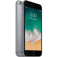
<img class="mobileOnly" src= ... />
Full Width on Desktop
There are often times when an element is sized to a specific width (e.g. images on fixed-width pages), but when the page is rendered on a larger browser in a fluid grid template, that element should be stretched to span the entire width of the container in which it resides.
.fwd (Full Width Desktop)
Example:
The following image is only 300px wide, but it will always stretch to fill 100% of the width of its parent container (in this case, the grid_8 div) because it has the "fwd" class.

Full Width on Mobile
There are often times when an element is sized to a specific width on desktop browsers, but when the page is displayed in it's single, narrow column on a mobile device, that element should be stretched to span the entire width of the mobile content area. E.g. the small thumbnail images that often accompany small blocks of text on the desktop browser.
.fwm (Full Width Mobile)
Example:
The following image displays at 300px wide on desktop browsers and expands to 100% width on mobile devices.
Another Example:
Whenever possible, buttons should be forced to display at full width on mobile devices. This
can be done by adding the .fwm class to the button.
Notes:
(1) This class can be applied to any HTML element, not just images and button as shown in the above examples.
(2) Any image that is assigned the .fwm class should be 720 pixels wide to prevent image distortion.
Horizontal Link List
.responsiveLinkList
A horizontal list of hyperlinks on a desktop browser that will appear as clickable buttons on a mobile device.
Code:
<ul class="responsiveLinkList">
	<li><a href="#">Link 1</a></li>
	<li><a href="#">Link 2</a></li>
	<li><a href="#">Link 3</a></li>
	<li><a href="#">Link 4</a></li>
	<li><a href="#">Link 5</a></li>
</ul>
Example:
Vertical Link List
.responsiveLinkList2
A standard vertical ordered or unordered list of hyperlinks on a desktop browser that will appear as clickable buttons on a mobile device.
Code:
<ul class="responsiveLinkList2">
	<li><a href="#">Link 6</a></li>
	<li><a href="#">Link 7</a></li>
	<li><a href="#">Link 8<span class="noLink">Example of Extra Text</span></a></li>
	<li><a href="#">Link 9</a></li>
	<li><a href="#">Link 10</a></li>
</ul>
Example:
Code:
<ol class="responsiveLinkList2">
	<li><a href="#">Link 11</a></li>
	<li><a href="#">Link 12</a></li>
	<li><a href="#">Link 13<span class="noLink">Example of Extra Text</span></a></li>
	<li><a href="#">Link 14</a></li>
	<li><a href="#">Link 15</a></li>
</ol>
Example: