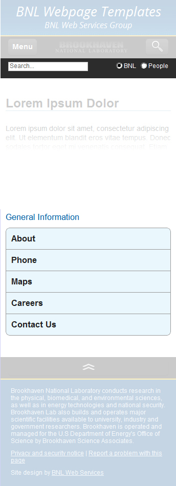
Header Section

Description
The header section contains the global navigation links and the website search form.
Location of Code
The first part of
the header's HTML code is located in /common/templates/global/includes/header.inc.
The second part is located in /common/templates/searchbox/search_generic.inc. Alternative search code may be used
by referencing a site-specific search code include file: /common/templates/searchbox/search_SITE_NAME.inc.
Additional Notes
The <div id="header"> is located outside any grid container and therefore
will span 100% of the width of the browser window.
A <div class="container_12"> is located within <div id="header">
and will therefore constrain the global nav links and search form elements
to the width of the grid 940-pixel-wide content container.
The <ul id="globalLinks"> is placed inside <grid class="container_7"> so
that the global nav links will be aligned to the left side of the 940-pixel-wide grid content container.
All of the site search code is placed inside <grid class="container_5">, which has the
text-align property set to right so that the site search box and buttons will be aligned to the right side of
the 940-pixel-wide grid content container.
NOTE: This first part of
the header's HTML code is located in /common/templates/global/includes/header.inc.
The second part is located in /common/templates/searchbox/search_generic.inc. Alternative search code may be used
by referencing a site-specific search code include file: /common/templates/searchbox/search_SITE_NAME.inc.
The following HTML is contained in
/common/templates/global/includes/header.inc.
<a id="mobileTopAnchor" class="mobileOnly" name="top"></a>
<a id="mobileMenuAnchor" class="mobileOnly" name="mobileMenu"></a>
<h4 class="mobileOnly mobileMenuTitles" id="siteMenuHead">Site Navigation</h4>
<h4 class="mobileOnly mobileMenuTitles" id="generalInfoMenuHead">General Information</h4>

<div id="mobileMenuSearchBar" class="mobileOnly">
	<div class="container_12">
		<div class="grid_12">
			<a
				id="mobileSearchButton"
				href="javascript:void();"
				class="large button"><img
					alt="search"
					title="search"
					src="/common/templates/global/images/search-icon-28px.png" />
			</a>
			<a
				title="menu"
				id="mobileMenuButton"
				href="javascript:void();"
				class="large button">Menu</a>
			<a
				id="bnlMobileLogoLink"
				alt="BNL Home"
				title="BNL Home"
				href="http://www.bnl.gov"><img
					id="BNLlogoMobile"
					alt="BNL Home"
					src="/assets/global/images/bnl-logo-2021.svg" />
			</a>
		</div><!--grid_12-->
	</div><!--container_12-->
</div><!--mobileMenuSearchBar-->

<div id="mobileFooterTopBar" class="mobileOnly">
	<div class="container_12">
		<div class="grid_12">
			<a
				id="bnlMobileFooterTopLink"
				href="javascript:void();"
				class="large button"><img
					alt="Top of Page"
					title="Top of Page"
					src="/common/templates/global/images/top-icon-28px.png" />
			</a>
		</div><!--grid_12-->
	</div><!--container_12-->
</div><!--mobileFooterTopBar-->

<div id="header">

	<div class="container_12">

		<div class="grid_7" id="globalLinksGridOuter">
			<ul id="globalLinks">
				<li><a href="https://www.bnl.gov/about/">About</a></li>
				<li><a href="https://www.bnl.gov/search/">Phone</a></li>
				<li><a href="https://www.bnl.gov/maps/">Maps</a></li>
				<li><a href="https://www.bnl.gov/hr/careers/">Careers</a></li>
				<li><a href="/common/templates/feedback/index.php" rel="shadowbox;height=600;width=380;" class="lastLink">Contact Us</a></li>
			</ul>

		</div><!--grid_7-->
The following HTML is contained in
/common/templates/searchbox/search_generic.inc.
		<div class="grid_5" id="searchGridOuter">
			<form id="searchBox" class="searchBoxOuter" method="get" action="http://search.bnl.gov/">
				<a id="searchAnchor" name="search"></a>
				<div id="search">
					<div id="searchButtonsContainer">
						<input
							class="searchButtons first"
							type="radio"
							checked
							name="restrict"
							value="default_collection"
						/>BNL
						<!--<input type="hidden" name="SITE_COLLECTION_NAME" value="Education" />-->
						<input
							class="searchButtons"
							type="radio"
							name="restrict"
							value="people"
						/>People
						<!--<input type="hidden" name="DEPT_RESTRICT" value="PA">-->
					</div><!--searchButtonsContainer-->
					<input
						id="searchBox"
						class="idleField"
						type="text"
						name="q1"
						size="20"
						maxlength="256"
						value="Search..."
						title="Type your search term in this box, then press the enter key on your keyboard."
					/>
				</div><!--search-->
			</form>
		</div><!--grid_5-->
		<div class="clear"></div> <!--must be here to prevent Firefox weirdness-->
	</div><!--container 12-->
</div><!--header-->
The following styles are contained in
/common/templates/global/css/BNL-master-styles.css.
/* HEADER */

#header {
	background-color: #000;
	background-image: url('/common/templates/global/images/header-bkg.jpg');
	background-repeat: repeat-x;
	border-bottom: 2px solid #fff;
	margin: 0px;
	padding: 0px;
	color: #fc3;
	height: 26px;
	}

	#globalLinks {
		margin: 0px 0px 0px 0px;
		padding: 0px;
		list-style-type: none;
		}

		#globalLinks li {
			display: inline-block;
			float: left;
			height: 9px;
			margin: 8px 0px 0px 0px;
			padding: 0px;
			color: #fff;
			font-size: 9px;
			line-height: 9px;
			font-weight: bold;
			text-transform: uppercase;
			overflow: hidden;
			list-style-image: none;
			}

		#globalLinks li a {
			color: #fc3;
			text-decoration: none;
			margin-right: 10px;
			padding-right: 10px;
			border-right: 1px solid #fff;
			}

			#globalLinks li a.lastLink {
				margin-right: 0px;
				padding-right: 0px;
				border-right: 0px;
				}


		#globalLinks li a:hover {
			color: #fff;
			text-decoration: none;
			}

	/* SEARCH BOX */

		div#search {
			text-align: right;
			margin-top: 2px;
			color: #fff;
			height: 14px;
			}

			div#search .focusField {
				background: #fc3;
				color: #000;
				}

			div#search .idleField {
				background: #fff;
				color: #666;
				}

			input#searchBox {
				display: inline;
				height: 14px;
				width: 150px;
				margin: 0px;
				padding: 0px;
				font-size: 12px;
				line-height: 14px;
				border: 1px solid #c0c0c0;
				}

		#searchButtonsContainer {
			display: block;
			float: right;
			margin: 2px 0px 0px 0px;
			padding: 0px;
			font-size: 11px;
			line-height: 16px;
			border: 0px;
			}

		#searchButtonsContainer .searchButtons {
			margin: 0px 2px 0px 5px;
			padding: 0px;
			height: 14px;
			width: 14px;
			font-size: 14px;
			line-height: 14px;
			vertical-align: text-top;
			}

		#searchButtons .first { margin-left: 0px; }
On mobile devices, the header content (like all other mobile content) is rendered in a single, vertical column.
Many of the mobile elements are hidden by default and are included towards the
top of the HTML page code (in the header.inc file).
However, when rendered on mobile devices, these mobile-specific elements are moved (using jQuery)
to other locations on the page before they are displayed.
When the browser window crosses the mobile threshold (<720px),
the /common/templates/global/css/mobile.css stylesheet along with
jQuery code located in /common/templates/global/scripts/BNLscripts.js
radically change the display and functionality of the elements in the header section.
The most significant of these changes is that the global navigation, site navigation (located outside of the header section), and site search are hidden by default on mobile devices. The global navigation links (along with the local site navigation links) are relocated to the bottom of the mobile page (below the page content area, just above the footer) and buttons are displayed at the top of the mobile page that allow the user to access the global navigation menu, the site navigation menu, and the search form, scrolling the browser to the appropriate element automatically whent the user presses the buttons.
The #mobileMenuSearchBar, which is hidden on desktop browsers is displayed just
below the #stripe on mobile browsers and contains buttons to display the menu (both global navigation
and the local site navigation) as well as the search form.
BNLscripts.js
function moveContentForMobile(){
	// Move elements to new location for mobile rendering
	$(".searchBoxOuter").hide();
	$("#mobileMenuSearchBar").insertAfter("#stripe");
	$("#mobileFooterTopBar").insertBefore("#footer");
	$("#mobileMenuSearchBar").show();
	$("#mobileFooterTopBar").show();
	$("#mobileMenuAnchor").insertBefore("#mobileFooterTopBar");
	$("#searchGridOuter").insertAfter("#mobileMenuSearchBar");
	$("#header").insertBefore("#mobileFooterTopBar");
	$("#navlist").insertBefore("#globalLinks");
	$("#mobileMenuAnchor").insertBefore("#header");
	$("#siteMenuHead").insertBefore("#navlist");
	$("#generalInfoMenuHead").insertAfter("#navlist");
}

// Mobile MENU Button

	$("#mobileMenuButton").click(function() {
		$("#header").show();
		$('html, body').animate({scrollTop: $("#mobileMenuAnchor").offset().top}, 2000);
		$("#siteMenuHead").fadeIn(4000);
		$("#navlist").fadeIn(4000);
		$("#generalInfoMenuHead").fadeIn(4000);
		$("#globalLinks").fadeIn(4000);
	});


// Mobile SEARCH Button

	$("#mobileSearchButton").click(function() {
		$(".searchBoxOuter").fadeToggle(1000);
	});
mobile.css
/* ----- MOBILE SEARCH NAV AND FOOTER (BLACK BARS) ----- */

	#mobileSearchButton,
	#mobileMenuButton,
	#bnlMobileLogoLink,
	#bnlMobileFooterTopLink { display: block; }

	#mobileMenuSearchBar,
	#mobileFooterTopBar {
		height: 42px;
		width: 100%;
		background-color: #2C2C2C;
		color: #fff;
		text-align: center;
		display: none;
		}

	#mobileMenuSearchBar { margin: 0; }

	#mobileFooterTopBar { margin: 20px 0px 0px 0px; }

	#BNLlogoMobile {
		height: 23px;
		margin-top: 9px;
		}

	#mobileSearchButton,
	#mobileMenuButton,
	#bnlMobileFooterTopLink {
		width: auto !important;
		margin-top: 5px !important;
		font-size: 14px !important;
		line-height: 14px !important;
		min-height: inherit !important;
		}

		#mobileSearchButton {
			float: right;
			padding-top: 0px;
			padding-bottom: 0px;
			margin-right: 5px;
			}

		#mobileMenuButton {
			width: auto;
			float: left;
			margin-left: 5px;
			}

		#bnlMobileFooterTopLink {
			padding-top: 0px;
			padding-bottom: 0px;
			margin-bottom: 0px;
			background: transparent;
			}


/* ----- SEARCHBOX ----- */


#searchBox,
.searchBoxOuter { display: none; }

	#searchGridOuter {
		margin: 0;
		padding: 0;
		width: 100%;
		max-width: 100%;
		}

	.searchBoxOuter {
		display: none;
		width: 100%;
		height: auto;
		min-height: 30px;
		float: none;
		margin: 0;
		padding: 5px 0px 5px 0px;
	    background-color: #2C2C2C;
	    color: #fff;
		}

	div#search {
		margin: 0px;
		padding: 0px;
		font-size: 18px;
		line-height: 18px;
		text-align: left;
	    color: #222222;
		}

	#searchButtonsContainer {
		display: block;
		float: right;
		text-align: left;
		margin: 3px 15px 0px 0px;
		padding: 0px;
		font-size: 12px;
		line-height: 12px;
		color: #fff;
		}

	#searchBox #searchBox {
		height: 12px;
		display: inline-block;
		float: none;
		margin: 0px 0px 0px 15px;
		clear: both;
		font-size: 12px;
		line-height: 12px;
		padding: 2px;
		}


/* ----- HEADER ----- */

	#header {										/* jQuery moves all the header content to just above the footer */
		display: none;								/* Site Nav, Global Nav, and Search are in header */
		width: 100%;
		min-width: inherit;
		margin: 0px;
		padding: 0px;
		height: auto;
		min-height: 10px;
		overflow: visible;
		background-image: none;
		background-color: transparent;
		/* border: 1px solid lime; */
		}